Skill learned: Answering IELTS Writing Test Topic: Describing images. Grammar: Sequencing words and passive voice
VIDEO
SAMPLE TESTS
EXAMPLE 1
SAMPLE ANSWER- Chart
The chart shows the percentage of people in the US who listen to the radio or watch TV at different times of the day.
In the US, radio listening is highest in the morning, while TV viewing is highest in the evening.
In the early morning, about 30% of people listen to the radio, but only 5% watch TV. After that, radio listening slowly decreases during the day. It falls to just 5% at night.
In contrast, TV viewing increases during the day. It reaches 45% in the evening, which is the highest point. After that, it decreases slightly to 35% late at night.
SAMPLE ANSWER- Chart
The diagram shows how concrete blocks are made.
Concrete blocks are produced by molding a mixture of cement, sand, gravel, and water into block shapes, and then allowing them to dry and harden.
First, cement, sand, gravel, and water are mixed together in a machine to form a thick mixture. Then, this mixture is poured into moulds to create the shape of the blocks.
Next, the blocks are pressed by a machine to make them strong and even. After that, they are removed from the moulds and left to dry.
Finally, the blocks harden over time and become ready for use in construction.
NEW WORDS
Sample, chart, percentage, diagram, concrete block, produce, mold, mixture, cement, sand, gravel, allow, harden, pour, mould, pressed, construction, paraphrase, overview, concluding
GUIDE ON HOW TO ANSWER
Guided Structure for B1 Students
- Introduction (1 sentence)
Paraphrase the task.
Example: The chart shows the percentage of people in the US who listen to the radio or watch TV at different times of the day.
- Overview (1–2 sentences)
Give a general idea of the process.
Example: In the US, radio listening is highest in the morning, while TV viewing is highest in the evening.
- Details (3–5 sentences)
Describe your observations in more details.
Example:
The listening pattern for radio.
The watching pattern for TV. - A concluding sentence (in future lessons)
EXERCISE 1 (Fill in the blank)
NEW WORDS
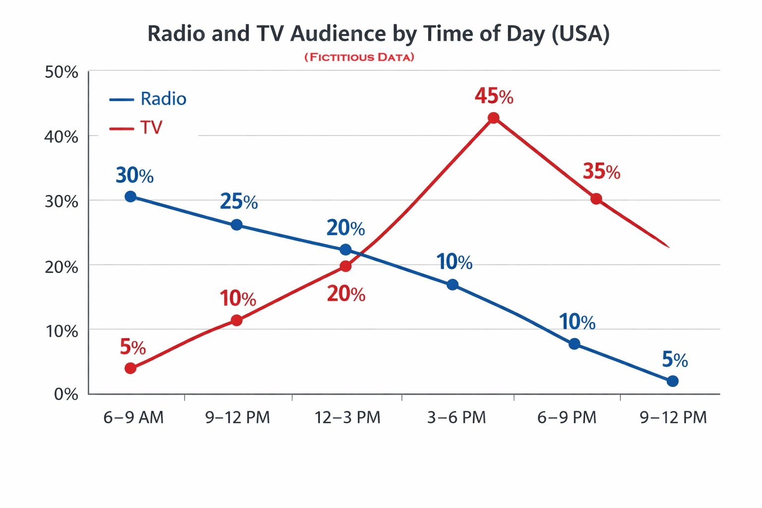
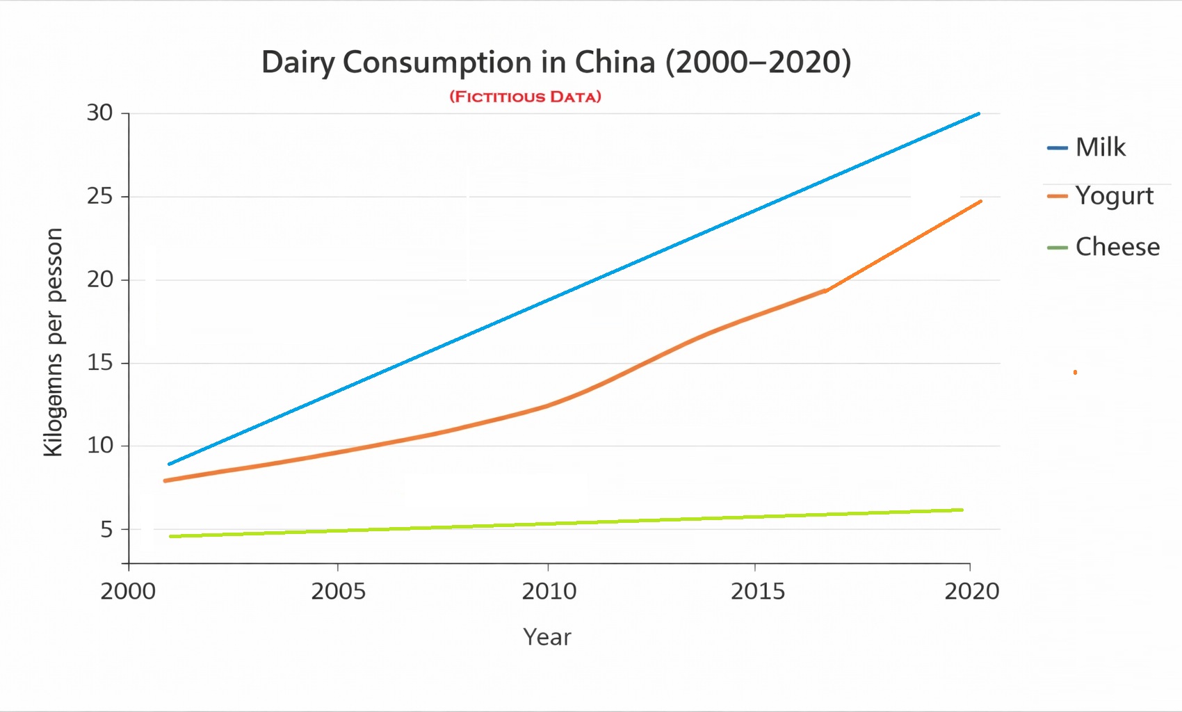
Line graph, illustrate, dairy, consumption, yogurt, measured, period, in contrast, trend,
Words used to describe a chart: Increase, decrease, rise, drop, sharply, gradually, stable, constant, unchanged, double, triple, reduced by half, pattern
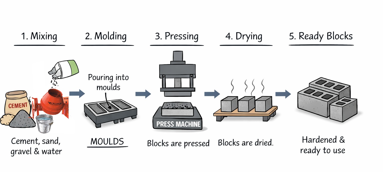
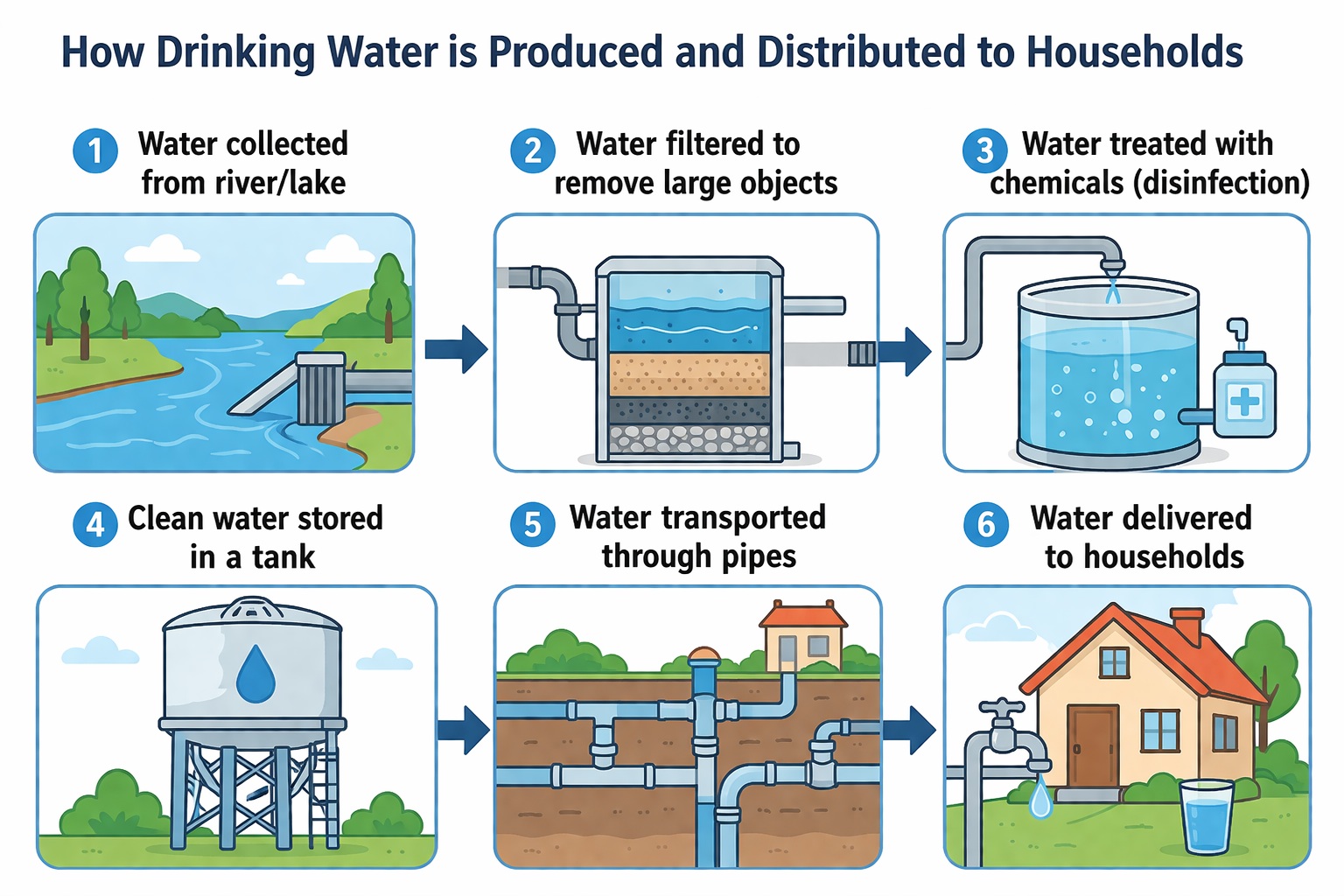
Produce, distribute, diagram, household, process, collection, filter, treatment, chemical, disinfection, store, transport, deliver,
Words used to describe a process: Collect, pump, pipe, flow, filter, treat, store, transport, deliver, mix, mixture, pour, press, mould (mold), harden.
Dairy consumption in China
The line graph illustrates dairy consumption in China, including milk, cheese, and yogurt, ______ 2000 ______ 2020, measured in kilograms per person.
Briefly, consumption of all three products shows an ______ over time. Milk remains the ______ consumed product, ______ cheese has the ______ levels throughout the period.
Milk consumption rises ______, increasing from under 10 kg ______ nearly 30 kg by 2020. Yogurt consumption also grows ______, especially after 2010, when it increases more ______ to reach around 25 kg.
In contrast, cheese consumption shows a more ______ trend. It increases slowly from under 5 kg to slightly more than 5 kg, and it is the ____ popular dairy product during the whole period.
.
How drinking water is produced and distributed
The diagram shows how drinking water is ______ and ______ to households.
The process includes the collection of water, its storage and distribution.
First, water is ______ from rivers or lakes.
Then, it is ______ to remove large objects.
After that, it is ______ with chemicals.
Next, the water is ______ in a tank.
Finally, it is ______ through pipes to households.
EXERCISE 2 (Write complete answers)
NEW WORDS
Consumption, steadily, stable,
Heating, System, diagram, draw, filter, burner, duct. fan, heat exchanger, supply, travel, distribute, cycle, flow, heat, cool
ANSWER (Hover to reveal)
Coffee consumption in three the UK, US and Japan from 2000 to 2020.
The line graph shows coffee consumption in three countries from 2000 to 2020.
In the USA, the number increases more slowly, going from about 1 cup to around 2 cups.
Japan shows a small increase and stays quite stable during the period.
ANSWER (Hover to reveal)
How a Warm-Air Heating System Works
The diagram shows how a warm-air heating system works in a house.
GRAMMAR
METHOD
Listen- Comprehension-Read (Vocabulary, pronunciation) -Grammar- Speaking